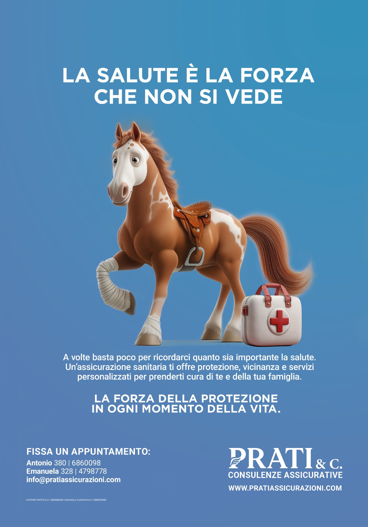
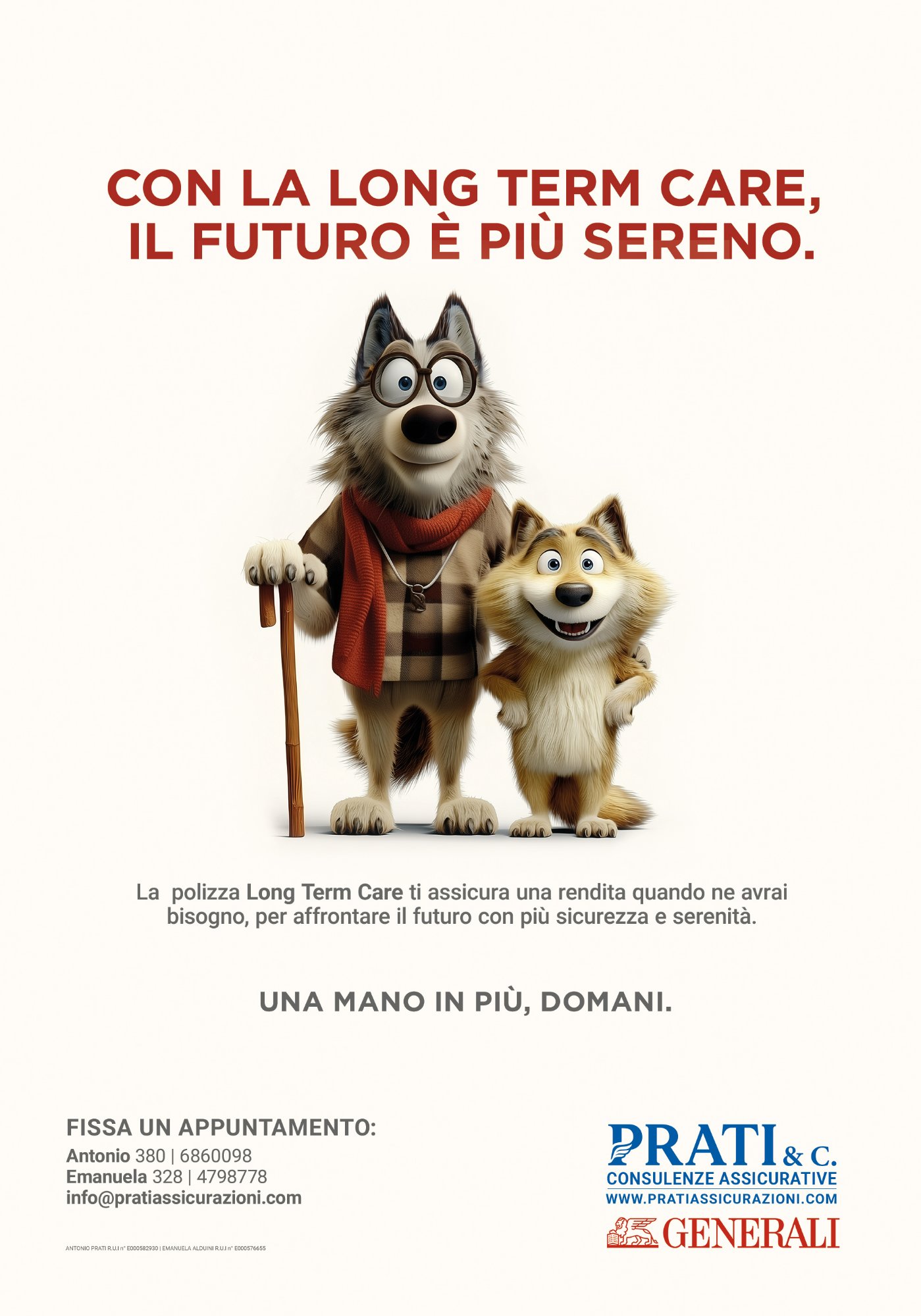
Prati
Assicurazioni

Client

Prati & C.
Consulenze Assicurative
Bagnolo Mella, Brescia

Scope

Brand Identity · Logo · Web Design · Campaign Strategy · Copywriting · Interior Design

Year

2024–2025

Prati Assicurazioni — Studio overview
01 — Challenge

Starting from Zero

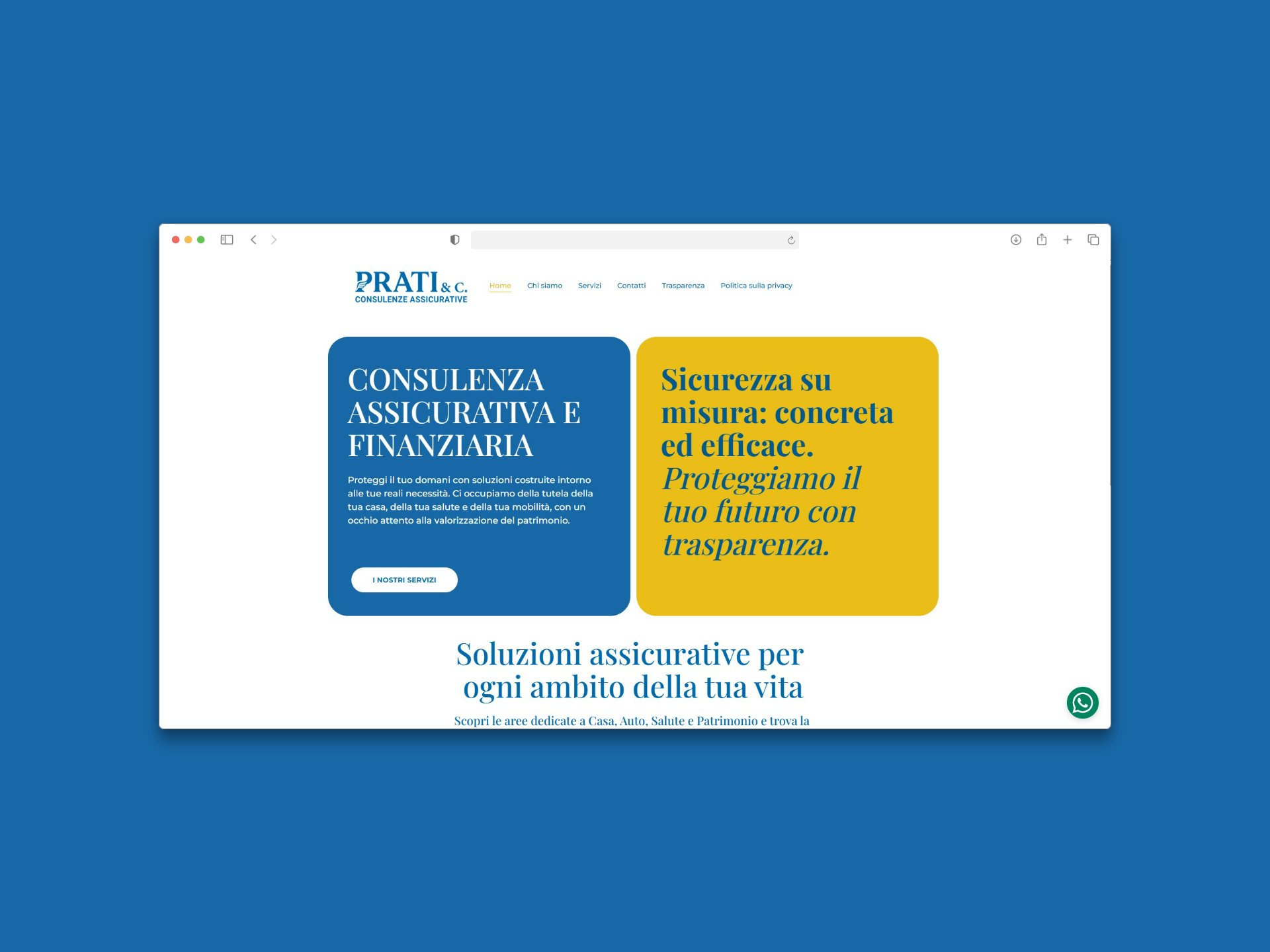
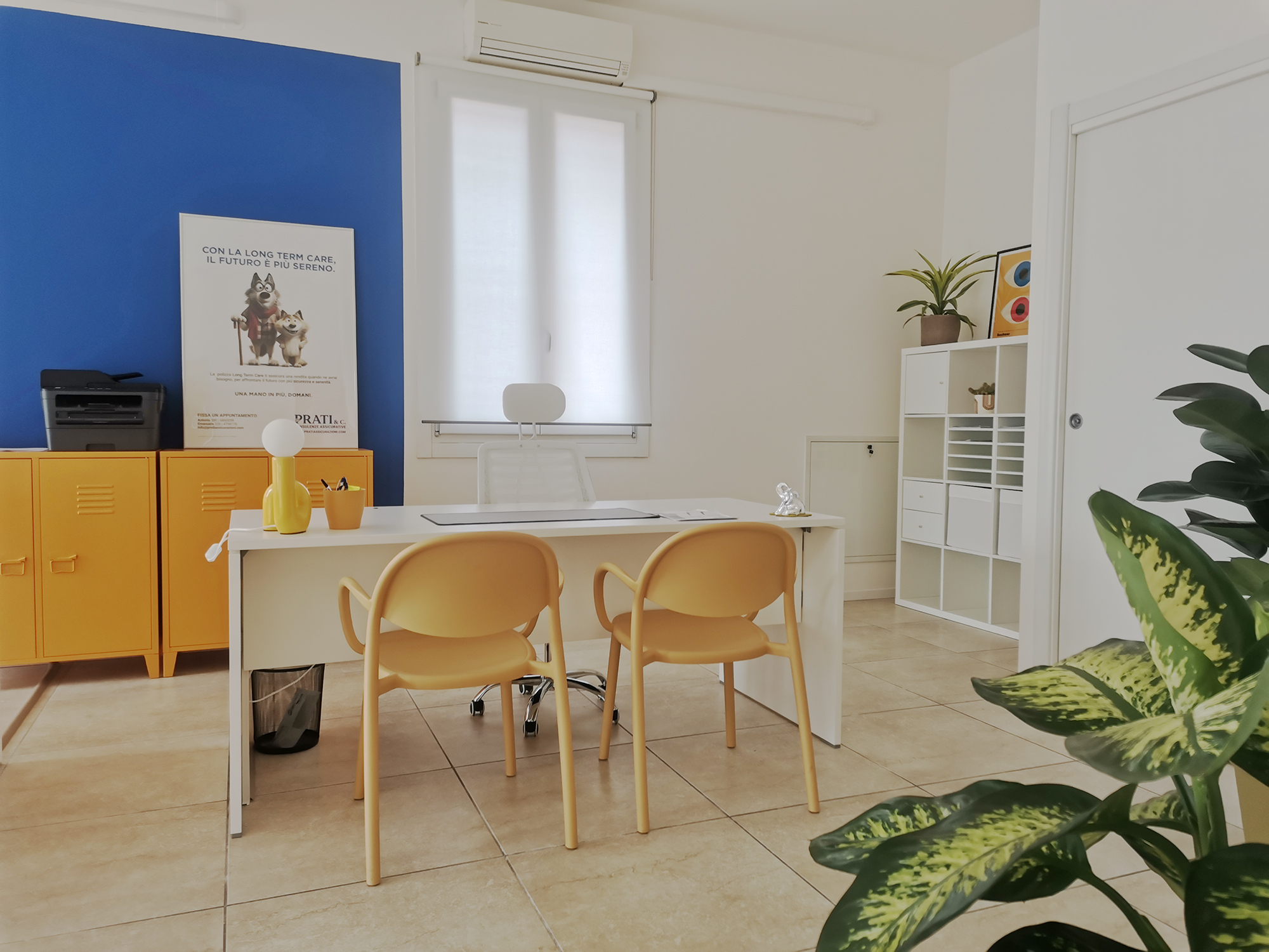
Prati & C. Consulenze Assicurative is a young insurance consultancy based in Bagnolo Mella, Brescia. When we started working together, they had no brand at all — no logo, no visual language, no digital presence.

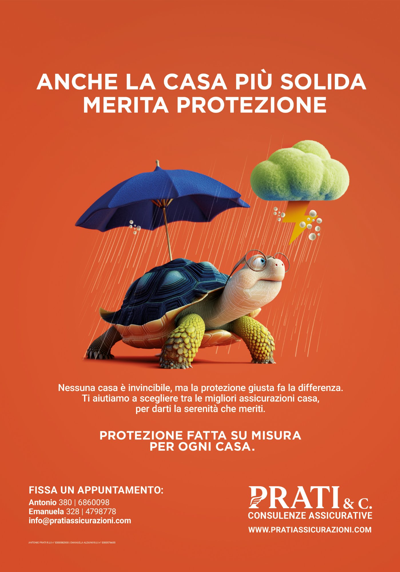
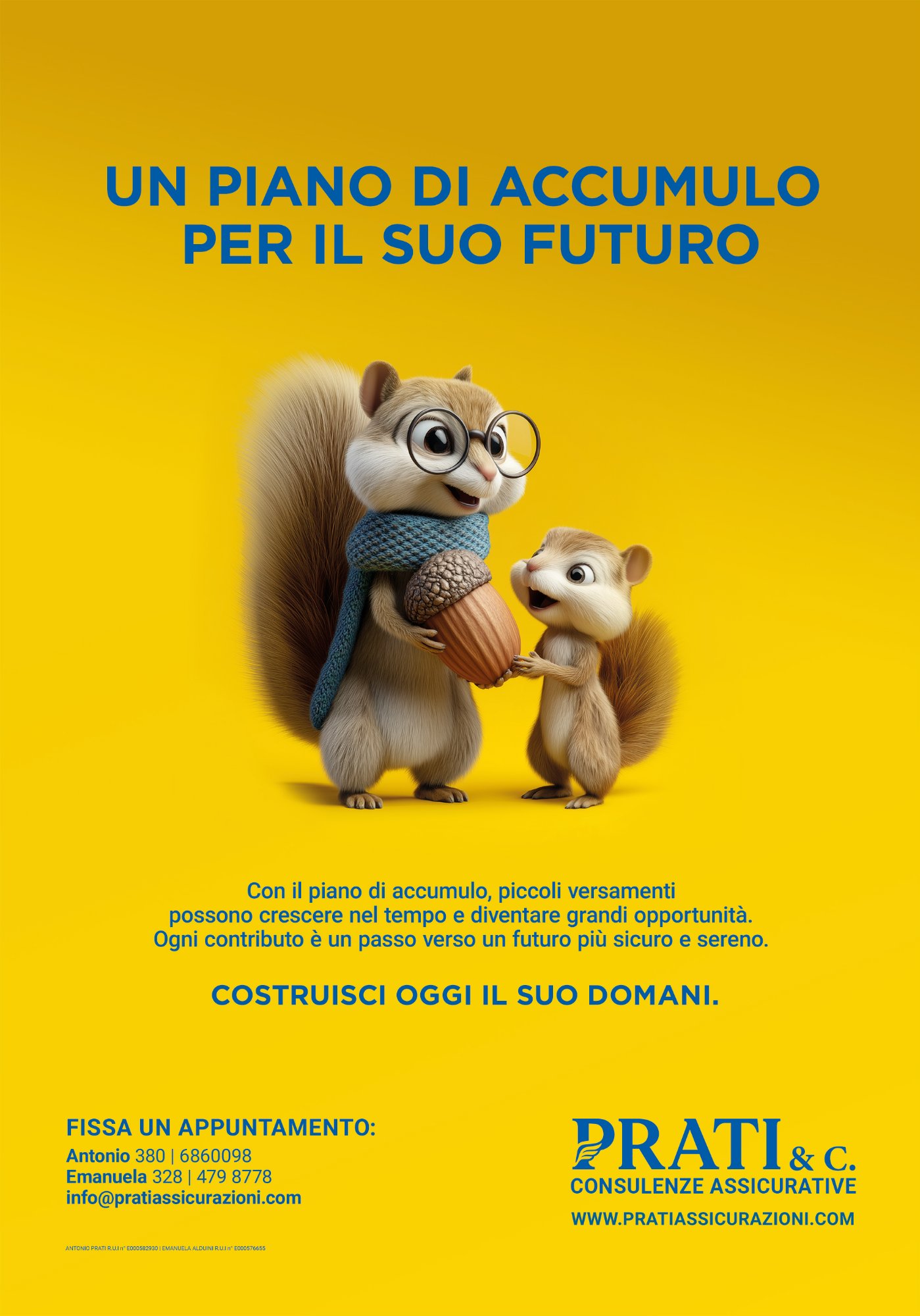
The brief was as open as it gets: be original, stand out from the big players — Generali, Allianz — who they collaborate with but whose visual identity reads as dated and corporate. A young team, a human approach, a local reality that wanted to be remembered.

They gave me full creative freedom. That kind of trust is rare, and it deserves to be honored with real work.

02 — Brand Identity

The Mark

The brand name is the founders' surname — Prati. The logo builds on the letter P, into which I embedded a graphic symbol recalling an angel's wing — a subtle, elegant reference to the core concept of the business: protection.

The color palette is built around blue and white — blue for security and trust, white for clarity and approachability. The typography pairs a refined serif for the brand name with a modern sans-serif payoff, balancing institutional weight with contemporary lightness.

For the physical space, I introduced a third color: yellow. Used selectively on furniture, lamps, and accent pieces, it brings energy and warmth — because this is a young agency run by real people, not a faceless corporation.

Prati Assicurazioni — Website
Prati Assicurazioni — Consulting room
03 — Campaign

The Animal Kingdom

For the advertising campaign, I developed a cast of animal characters — each one embodying a different insurance product through metaphor. The approach is warm, witty, and completely unexpected in the insurance sector.

A turtle sheltering under an umbrella in a hailstorm for home insurance. A raccoon dressed as a thief for car coverage. A squirrel passing an acorn to a smaller one for savings plans. An elderly wolf and his companion for long-term care. A horse with a bandaged leg for health insurance.

Each character was built through AI generation and my own post-production — every detail refined, every expression designed. I also wrote all the headlines and body copy for the entire campaign, from concept through to the final word on every poster.

Anche la casa più solida merita protezione L'RC auto è un obbligo. La tranquillità, è una scelta.
Un piano di accumulo per il suo futuro La salute è la forza che non si vede
Un piccolo gesto oggi, una grande serenità domani Con la long term care, il futuro è più sereno
"An entire agency in a single person — from the brand mark to the walls of the office."
04 — Result

What Was Built

A complete brand system — logo, color palette, typography, brand guidelines — extended across every touchpoint: website, social media templates, print materials, business cards, signage, and the physical design of the office space.

The large-format campaign posters hang on the studio walls, turning the workspace itself into a brand statement. The result is a coherent environment where every element — from the screen to the chairs — tells the same story.

A single creative direction, a single point of contact, a complete and consistent identity. From the first digital impression to the physical experience of walking through the door.

← Back to Work Next Case Study →