Railab
Fair Technology

Client

Railab Srl
Robotics & Innovation Laboratory
Brescia

Scope

Brand Strategy · Logo Design · Visual Identity · Mascot Design · Stationery · Corporate Presentations · Infographics

Year

2022

Railab — Fair Technology
01 — Brief

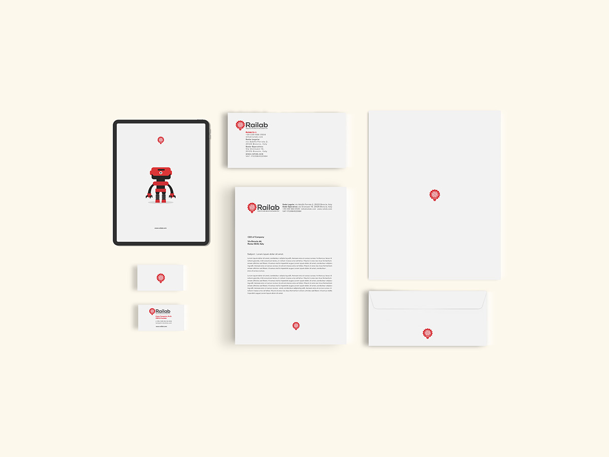
An Innovation Hub with 15 Years of Experience

Railab Srl is a Brescia-based company specialising in robotics, automation, and artificial intelligence, with over 15 years of industrial experience. Despite its deep technical expertise, the brand had no coherent visual identity — and needed one that could communicate simultaneously to industrial clients and to the wider tech ecosystem.

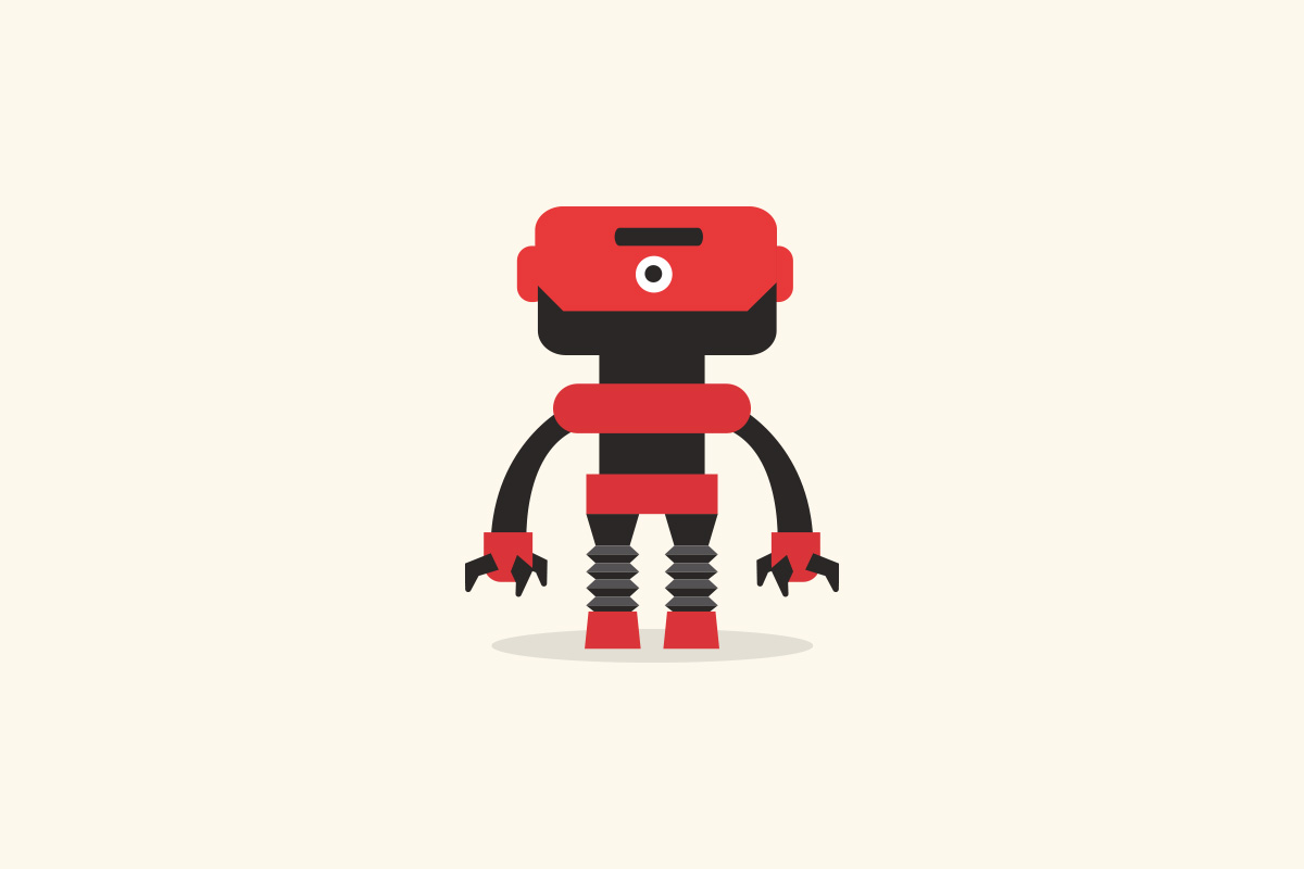
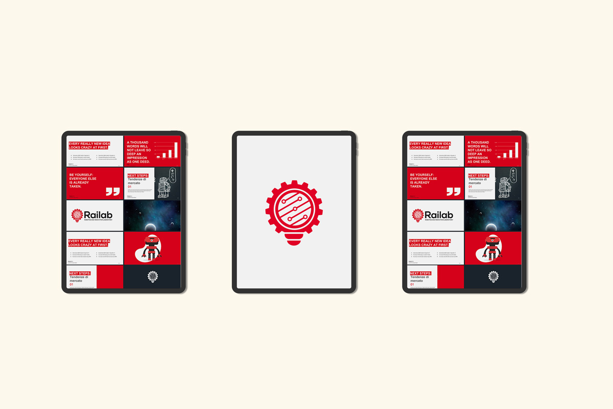
The positioning concept that emerged from the brief was "Fair Technology": innovation that is powerful yet human-centric, balancing industrial strength with digital intelligence. Every design decision was made in service of this idea.

02 — The Symbol

Three Concepts, One Mark

The pictogram is a custom-engineered mark that merges three distinct concepts into a single cohesive icon. The lightbulb at the core represents the initial spark of intuition and creative problem-solving. The gear as the outer silhouette communicates industrial reliability and precision engineering. The circuitry lines inside represent the digital brain — how Railab gives life to mechanics through artificial intelligence.

This synthesis tells a complete story: every Railab solution starts with an Idea, is built with Mechanical excellence, and is driven by AI intelligence. The mark was sketched by hand before being developed as a precise vector — a process that kept the symbol grounded in human intuition even as it became technically rigorous.

Railab logo sketch and final vector
03 — Color & Typography

Energy vs. Sophistication

The brand palette is built on Industrial Red and Cream, with the primary logo rendered in Gray. Red commands attention and evokes the energy and dynamism of the tech sector. Cream softens the aggression of the red, providing a sophisticated and human feel that aligns with "Fair Technology." Gray gives the logo maximum authority and timelessness across all technical applications.

The wordmark was developed starting from Roboto as a foundation — chosen for its clean, mechanically precise legibility — then customised to align with the geometric weight of the pictogram. The tagline uses Nexa Bold, whose geometric structure creates a clear visual hierarchy with the main wordmark.

Mykot infographic Mykot logo
04 — The Mascot

Humanising Technology

A key element of the brand storytelling is a custom character mascot: a small, charismatic robot designed with subtle visual nods to the company's founder as a playful tribute. While Railab operates in the high-tech B2B sector, the character breaks the coldness of traditional industrial robotics — humanising the company and making complex AI presentations more approachable and memorable for clients.

The mascot is integrated throughout the corporate presentation system, guiding viewers through technical data and creating a narrative flow that is both professional and engaging.

Railab brand mascot — custom robot character Railab corporate presentation system
05 — Applications

A Complete Brand System

Beyond the core logo, the project included a complete coordinated visual identity: stationery (letterhead, business cards, envelopes), digital assets, and a modular system of visual elements for corporate presentations. Every touchpoint uses the established grid, custom typography, and the Red/Cream/Gray palette.

Railab stationery — letterhead, business cards, envelope Railab brand mascot — custom robot character
06 — Mykot

A Product Within the Brand

Mykot — My Knowledge of Things — is Railab's cloud robotic ecosystem for remote control: a platform that allows operators to visualise, access, control, and manage robotic systems from anywhere in the world. As a distinct product within the Railab family, Mykot required its own logo — one that could stand independently while remaining visually coherent with the parent brand.

The Mykot mark is an elegant symbolic fusion: a mechanical gear transforms into a living eye, with a bright red iris at its centre. The washer symbolises precision and engineering reliability. The eye represents an active camera — constant connection and vigilance, the fundamental characteristics of a cloud robotic ecosystem. A product logo that tells its own story while remaining unmistakably part of the Railab family.

← Back to Work View Full Portfolio →